A future-proof solution for patrol coordination in high-risk neighbourhoods.
Role
Product Designer — Team of six designers.
Duration
Four months — Ongoing.


THE PROJECT
Digitizing community safety
High school classmates Steven Pickens and Mazzie Casher founded Philly Truce in 2020 as Philadelphia's homicide rate approached 500. In response, they launched Peace Patrol (Operation Hug the Block), a program that empowers justice-impacted men to collaborate with police through daily neighbourhood patrols in high-risk areas. As the network of Peace Patrol Officers (PPO) continues to grow, Philly Truce now faces the challenge of digitizing its operations to enhance coordination and expand its impact.
Overview
This case study showcases how I worked through a series of sprints to design an MVP dispatch management platform for Philly Truce. The new dashboard will be replacing the founder’s manual workflow, streamlining Peace Patrol coordination, task assignment and scheduling across routes, while scaling to accommodate the growing network of Peace Patrol Officers (PPOs).
Please note that this is an ongoing project, hence all screens are presented in mid-fidelity.
MY ROLE
Embracing agile collaboration
After working solo in a non-agile environment at Anxilla, I embraced the fast-paced, collaborative nature of this role. This role was about making a meaningful impact in a short period through collaborative & iterative design processes. I welcomed the opportunity to learn more about myself through others across a cross-functional team of designers, developers and product strategy.
THE GOAL
An evolving approach to conflict resolution
Philly Truce recently changed their approach: Shifting towards incident prevention and preemptive actions rather than emergency response.
Previously...
Philly Truce mobile app served as incident report management platform (IRMP). The platform used a chatbot to encouraging people of all ages to inform a PPO of a potential or ongoing incident, which PPO would help mediate and report through the app.
While this system was effective, it placed the responsibility on community members to report incidents, potentially limiting its reach.
Currently...
To enhance operations, Philly Truce is now focusing on developing a dispatch management dashboard for dispatchers to oversee and assign PPO shifts and tasks, ensuring high-risk neighbourhoods are regularly patrolled.
While the chatbot and IRMP remain integral to the app and continue to empower PPOs in incident management, the new dashboard aims to ensure consistent patrols, fostering a continuous sense of safety in the community.
Our goal: 100+ volunteers, 10+ routes
The design team was responsible for transforming the clients pen-to-paper approach for volunteer coordination to support the coordination of 100+ volunteers.
We were to create an MVP for a dashboard that would serve as a central point for all information needed to allow Philly Truce to coordinate volunteers in 10+ different high-incident routes across Philadelphia.
KEY CHALLENGES
Working with uncertainty
An incomplete
picture
With limited time per sprint, the exploratory research and design processes ran in parallel. The clients’ needs and preferences for how a digitized version of PPO management should function was being identified in real time by the research team, as the design team began to work on wireframes.
To add to this, as this would be the first time Philly Truce dispatchers were engaging with a digital platform, their needs and preferences were constantly evolving.
With fluctuating client preferences, and evolving research insights, our design team would have to move forward with incomplete information and make educated assumptions while designing the system.
Mirroring real-life
processes
We needed to create a flexible dashboard that mirrored how dispatchers intuitively coordinate PPOs in real life—where routes are planned on the fly, and schedules are managed via group texts.
With limited initial data, we had to identify core functionalities for the MVP while ensuring the platform could support the various manual actions dispatchers were accustomed to performing. The challenge was to balance structure with adaptability, allowing for seamless digital transition without disrupting their existing workflows.
APPROACH
Incorporating systemic design principles
Our team worked in fast-paced sprints, focusing on a different key section of the user flow in each sprint cycle. By designing and handing off prototypes for research in parallel, we ensured rapid feedback loops—allowing us to iterate on previous sections while simultaneously developing new ones. The different sections of the dashboard were split up according to 4 core use case reflecting how dispatchers currently operate:
Sprint 1
Sprint 3
Sprint 4
To balance these complex workflows, I took a systems-thinking approach to design, incorporating several principles throughout the project:
Aligning with the bigger picture: Attend meetings across product strategy and research teams, to keep abreast of product direction and align with stakeholders.
Identify use cases: Identify and tracked nuanced use cases, developing design variations to account for different workflows.
Accounting for scalability: Ensure that all designs can support 100+ volunteers and 10+ routes, ensuring design patterns are future-proof to accommodate growth.
Going beyond digital: Map out the PPO and Dispatcher journey beyond the digital touchpoint, to create designs that integrates with their real-world coordination methods.
Rationale toolbox: Documented key design decisions, trade-offs, and usability insights to provide a clear foundation for iteration.
part 1
Familiarity always wins
Use case
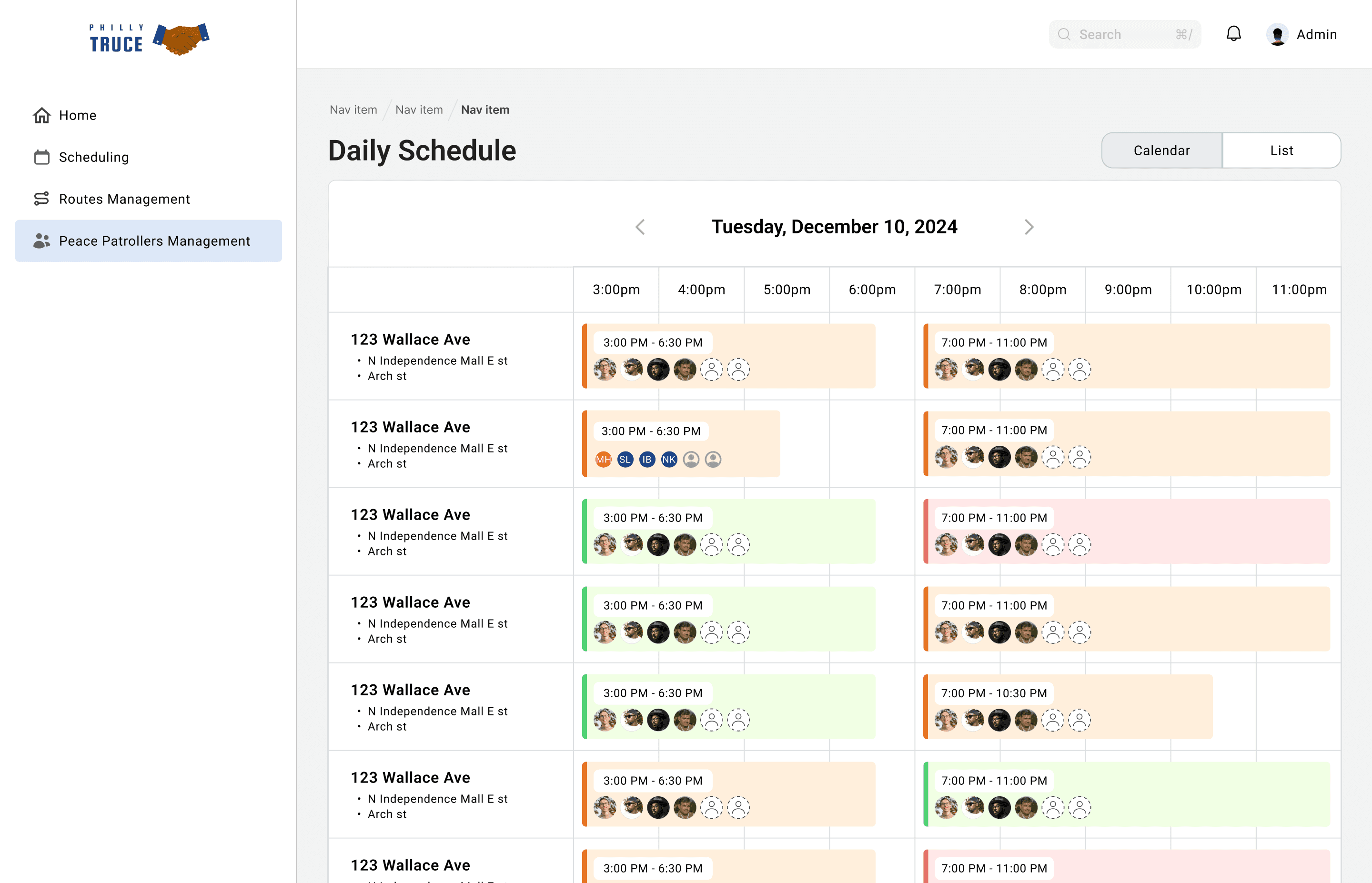
Monitoring daily operations: The home page provides an at-a-glance view of the current day’s schedule, helping dispatchers quickly assess which routes have been claimed by PPOs and identify gaps.
The Challenge
Incomplete information: A key uncertainty at this stage if dispatchers wanted to use this page to ‘assign’ routes to PPO, or let the PPO claim routes themselves via the Philly Truce mobile app.
My strategy
Incorporating familiar design patterns
According to Jakob’s Law, users prefer websites to work the same way as other websites they are familiar with. Drawing from this, I explored designs for a calendar format that is similar to Google Calendar, making it feel familiar and intuitive while also adapting it to this specific use case.
Incorporating flexibility & user preference
The calendar not only served as a quick-glance overview but also had the potential to evolve into an assigning tool—allowing dispatchers to easily adjust shift timings and assign shifts to PPO in the future. While others focused on table and list formats, I saw an opportunity to design for both immediate usability and long-term adaptability.
While advocating for the calendar, I accounted for the strengths of different views and suggested the option for dispatchers to switch between the calendar and list view.
The solution
Our team created multiple sketches:


My win
A pivot occurred between the first and second sprint, where the founders changed their approach:
“We no longer want to assign routes to PPOs. Instead we want PPOs to claim their own routes via the mobile app and would use this dashboard page primarily for monitoring those claimed routes.”
As I had I designed multiple options, I was able to advocate for the calendar design and highlight it’s strengths given the clients new interests. During usability tests the client selected the calendar view for being the most intuitive and easy to understand 🎉.
The calendar view was chosen as the main view for the home page, with an alternative ‘list view’ of routes being presented in a separate tab.
The first screen captures my initial sketch of the calendar view, while the second screen reflects later iterations. In these refinements, we transitioned from a horizontal to a vertical scroll and introduced a color-coding system to clearly indicate shift status — whether fully claimed, partially claimed, or completely empty.
PArt 2
Experimenting with new ideas
Use case
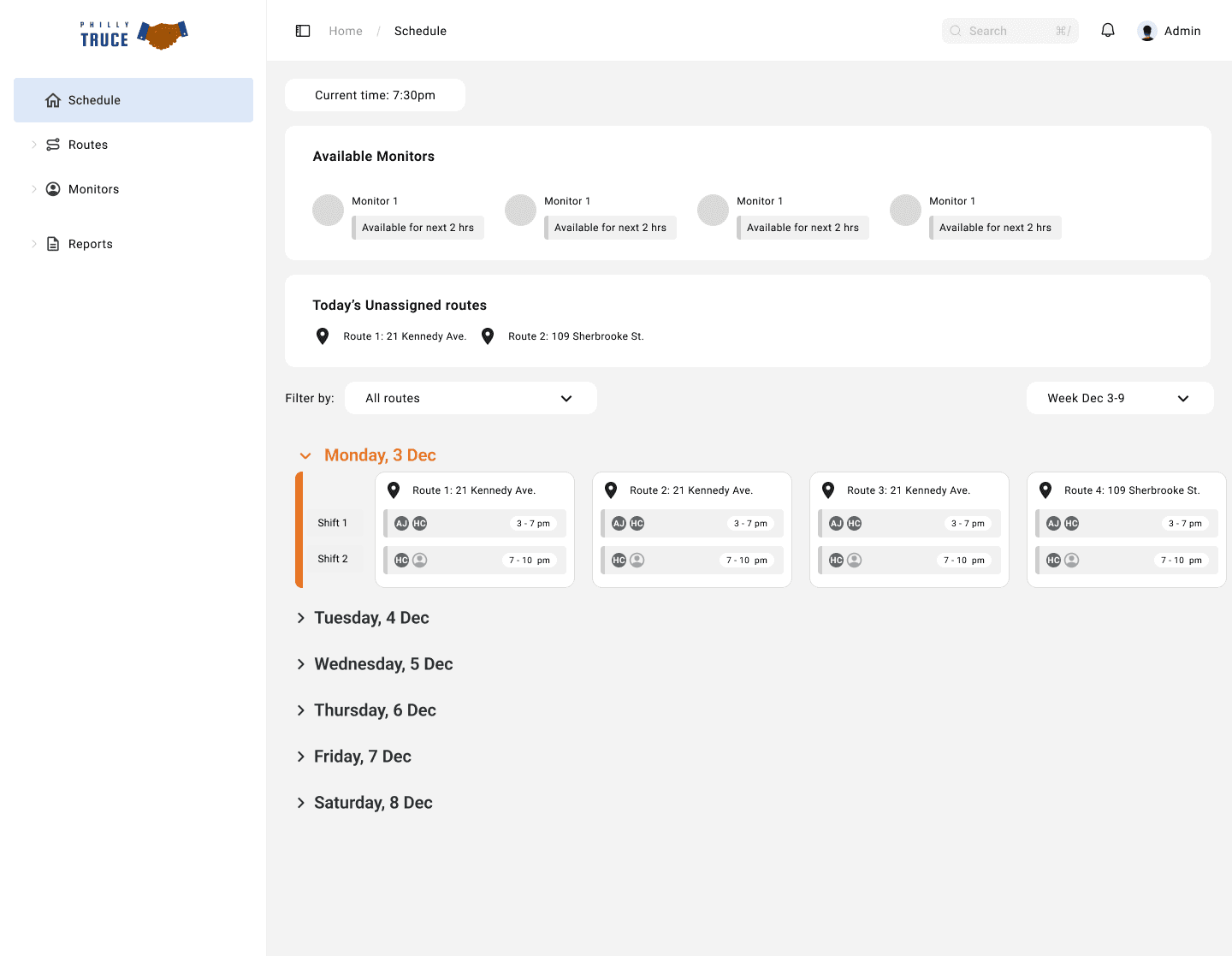
Scheduling weekly shifts: Given the pivot, a new scheduling page was required to allow dispatchers to create and publish daily schedules for the week, for PPOs to claim via the mobile app.
The Challenge
Repetitive choice points: Managing daily schedules one day at a time would require dispatchers to repeatedly select routes and shift times, which could quickly become overwhelming as the number of routes grows.
My strategy
Going back to the user flow
The team had only considered a daily scheduling view, requiring admins to sift through each day, one at a time and publish each daily schedule to the mobile app. I identified the potential inefficiencies with this approach and quickly explored a more streamlined design that allows for multi-day scheduling.
To do this, I revisited the user flow, trying to evaluate what was missing and what page or feature would allow the dispatcher to quickly complete recurring actions. I identified a potential missing step outlined in the user flow below:
Previous scheduling flow

My suggested scheduling flow

The solution

A new Route Assignment Page
This new page would allow dispatchers to assign recurring dates and shift times in one go to each route, minimizing the need for repetitive daily input.

Automated daily schedule creation
The input gathered from the route assignment page would be used to pre-populate the unpublished daily schedule. An automated schedule would be generated for each day. This removes the need for dispatchers to manually create a new schedule from scratch every day.
Allowing Real-Time Schedule Adjustments
Dispatchers would still retain the flexibility to edit the daily schedule as needed before publishing it. This balances efficiency with adaptability, mirroring the dynamic nature of volunteer coordination.
My win
This approach allowed me to balance user needs with system constraints, ultimately creating a more flexible and intuitive scheduling system. By designing a multi-day scheduling system, I reduced the manual workload for admins, making shift assignment more efficient.
Most importantly, this process taught me the value of experimentation and iteration. By revisiting the user flow and refining it, I opened the door to new ideas. When I shared these suggestions with my team, I was happy to get buy-in from the Design Lead 🎉.
This is still an ongoing work, and so these mid-fi wireframes have yet to be tested with the client. I’ve provided a snapshot of the screens I designed below:

PART 3
Developing consistent and intuitive flows
Use case
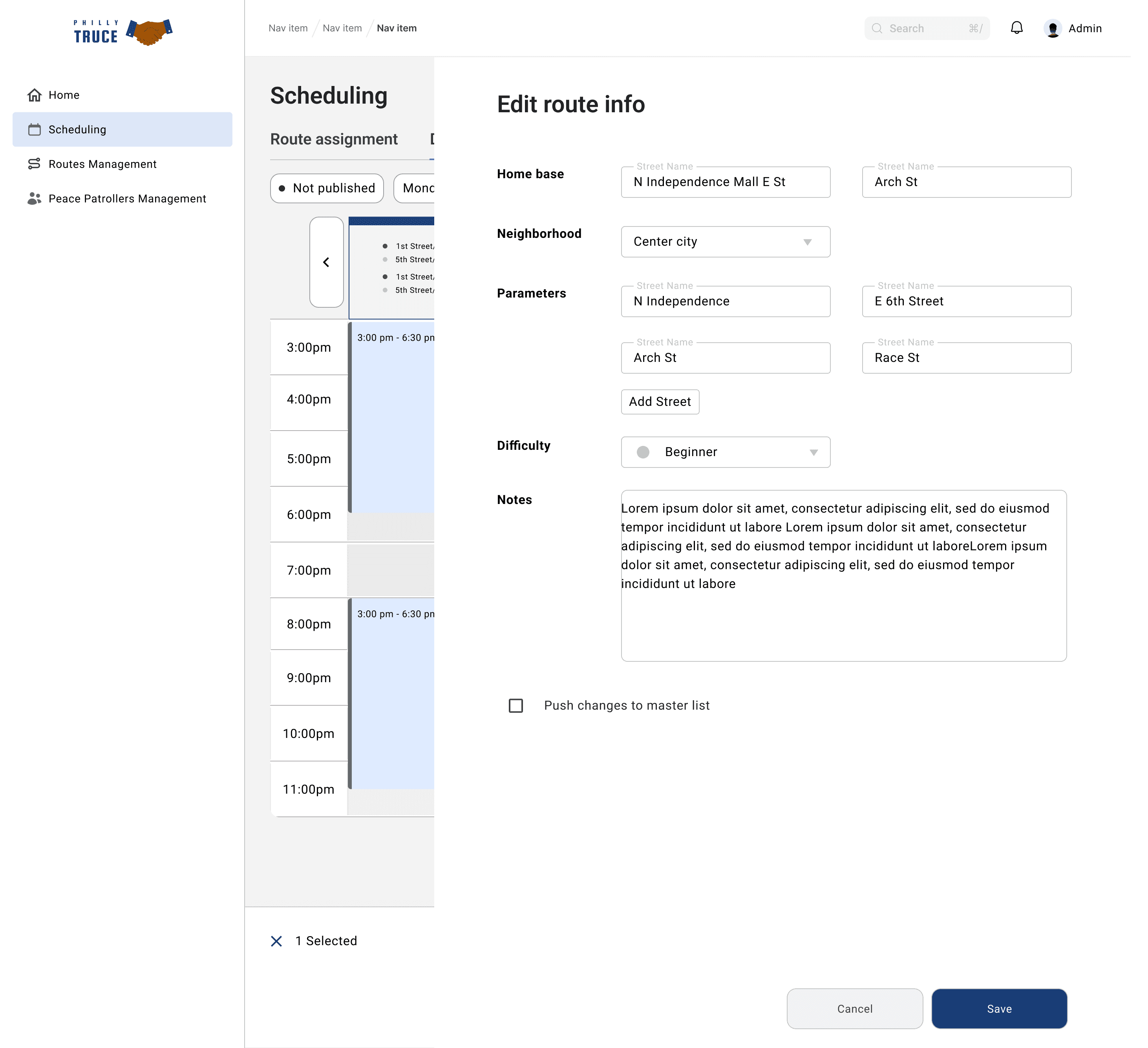
Creating a route management page: This page should allow admin to create new routes and archive old routes.
The Challenge
Information architecture: Information had to displayed clearly for the dispatcher to see in one go, allowing for scalability if new information is required.
My strategy
Collaborating with others
While I focused on designing the route management page, other designers were working on a similar layout for the Peace Patrol Officer (PPO) management page. I saw this as a great opportunity to learn from and build on their ideas. By actively collaborating and aligning our approaches, I was able to incorporate key elements from their design into my own work — ensuring consistency across the platform and creating a more cohesive user experience.
The Solution
We prioritized key information for the MVP, focusing on essential route details like parameters, neighbourhood, and notes. To maintain a clean, scannable layout while ensuring access to more context when needed, we designed an expandable notes section — allowing dispatchers to quickly get an overview and dive deeper with a simple click. Dispatchers could also edit route information from this page.

I also suggested bulk actions, to allow dispatchers to easily parse through multiple routes, which was adopted by the team. This includes a filter, sort and search option. I brainstormed options for these interactions to work which will be refined in the next phase.

Finally, I kept my designs consistent with the designs of my colleagues, who were creating the PPO management page. I aligned design elements wherever possible, as this would later contribute to a cohesive design system.
Ensuring consistency between route management and PPO management pages.
MY CONTRIBUTION
Taking a systems-thinking approach
I took an approach that ensures that the dashboard doesn’t lock the admin into rigid workflows but instead empowers them with control and adaptability—just as they would need when managing volunteers on the ground.
Designing for scalability
The dashboard was built with scalability in mind, ensuring that as the PPO network grows, the system can handle 100+ volunteers efficiently.
Features like list views, calendar-based scheduling, and batch route assignment help prevent bottlenecks and make it easier for admins to manage an increasing number of shifts and routes.
By designing a flexible scheduling system, the MVP supports both small-scale operations and potential expansion, reducing the need for major redesigns as the program scales.
Designing for flexibility
With Philly Truce shifting its priorities from emergency response to prevention, I designed the dashboard to mirror the flexibility needed in real-life volunteer coordination. I suggested the following features for flexibility:
Create a recurring schedule while still being able to make day-to-day adjustments, ensuring that shifts can be adapted based on real-time needs.
Push daily schedule changes back to the master list, maintaining alignment between short-term adjustments and long-term planning.
Add routes dynamically to accommodate high-priority areas or unexpected shifts in patrol needs.
CONCLUDING THOUGHTS
Storming and norming
Through this work, I’ve gained a deep understanding of what it truly means to implement agile principles. I’ve learned that while teams naturally go through a storming and norming phase, being adaptable and proactive helps accelerate collaboration. As a designer, I’ve focused on finding where I can add the most value — whether that means checking in on teammates, questioning existing processes, sharing ideas, or being open to feedback and change. It has really made me appreciate the people I work with, and the process, which I believe is the crux of agile.
Selected as Design Lead
As this project is an apprenticeship, positions are open to new applicants and need to be reapplied for every few months. For the next phase, I’ve been selected as the Design Lead and will be a co-leading a team of 4 designers through our next set of sprints. Stay tuned! 🚀
© Sharmeena Lalloo. 2024